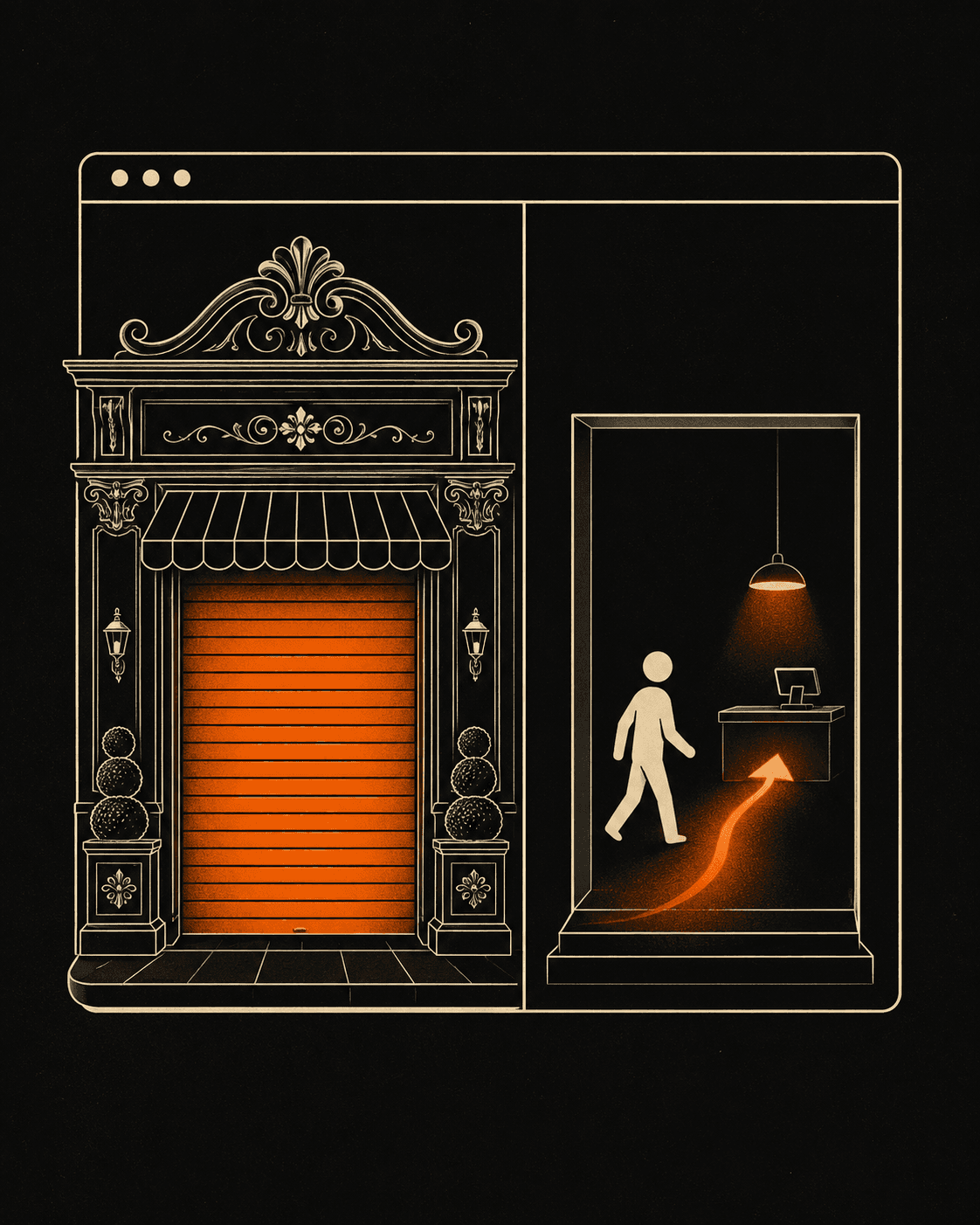
A modern website is a website built to convert visitors into customers, not one that looks current for a year and then dates. "Modern" describes a style. "Sells" describes a job. When a business owner emails me asking for "something modern," I have to translate it, because the word tells me nothing about what the site needs to do.
I build sites for small and local businesses from Xanthi, remotely. The clients who get the best results are the ones who stop describing a mood and start describing an outcome. Here is what to ask for instead.
Why is "modern" the wrong thing to ask for?
"Modern" is the wrong brief because it has no target you can measure. A site can be sleek, animated, on-trend, and still send zero leads to your inbox. Style and sales are separate problems. A designer can nail the first and miss the second completely, and you won't know until the traffic shows up and bounces.
Trends also rot. The flat look, the big hero video, the trendy font of the moment: all of it ages. If your only goal was "modern," you signed up to rebuild every two years to keep chasing it. Ask for clarity, speed, and a path to a sale instead, and the site keeps working long after the trend it launched with has moved on.
What should I ask for instead of "modern"?
Ask for five things, in plain words: strategy, clarity, a conversion flow, performance, and trust. Each one maps to a decision a visitor makes in the first few seconds, and each one is something you can check after launch.
Strategy is knowing who the page is for and what one action you want them to take. Clarity is a visitor understanding what you sell and why it's for them without scrolling or guessing. A conversion flow is the path from "interested" to "contacted you," with the button where the eye lands. Performance is the page loading fast enough that nobody leaves before it appears. Trust is the proof: real work, real faces, real reviews. Drop any one of these and the polished design carries dead weight.
Does it actually matter if the site is fast?
Yes, and it's the easiest of the five to measure. Google's research found that as page load time goes from one second to three, the probability a mobile visitor bounces rises by 32% (Google/SOASTA, "Find out how you stack up to new industry benchmarks for mobile page speed"). You spend money getting people to the page. A slow load throws a third of them away before they read a word.
This is where the word "modern" actively hurts you. Heavy sliders, autoplay video, and a stack of fonts all read as "modern" and all make the page slower. I build in Next.js and React partly because they let me ship a site that scores green on Core Web Vitals without stripping out the parts that sell. Fast is a feature your customers feel, even if they never name it.
How do you brief a developer the right way?
Tell them the outcome, the audience, and the one action. Not the adjective. Replace "make it modern" with "I want a plumber in Xanthi who lands on this page to call me, and I want the page to load instantly on a phone." That sentence gives a developer a target. "Modern" gives them a guess.
The rest is honesty about what you have. Real photos beat stock. A clear price or a clear "request a quote" beats a vague "contact us." Three genuine reviews beat a wall of invented ones. Bring those, and the design work gets faster, because every choice now has a reason behind it instead of a vibe to chase.
You can see how this plays out in my recent work, where the brief was always a result and never a style. If you want a site measured by what it brings in, tell me what you sell and who you sell to and I'll build to that. Short on budget or time, a starting template gives you the same conversion bones at a lower entry point.
A pretty site that sells nothing is a cost. A plain site that books clients is an asset. Ask for the asset.