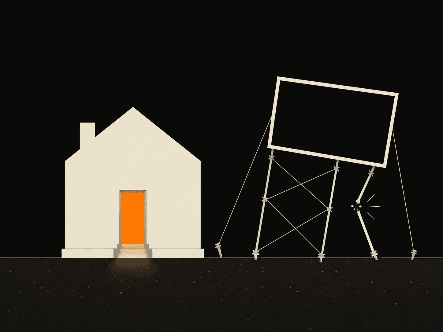
The visitor journey is the path a website walks a stranger down, from "I have a problem" to "I trust this person" to "I'll contact them." When that path is missing, people land, read a bit, and leave. Not because your service is wrong. Because the page never told them where to go next.
Most service sites I'm sent have all the right pieces and no order. A hero, an about section, a list of services, a contact form. Each is fine on its own. Together they ask the visitor to assemble the story themselves. Most won't. They'll close the tab and book whoever made it easy.
What is a visitor journey on a website?
A visitor journey is the deliberate sequence a page uses to move someone from problem to trust to action. It mirrors how a real buying decision happens in a person's head: first they recognize they have a problem, then they decide whether you're the one to fix it, then they take the step you want. A good page handles those three in that order, on one screen of scrolling, without making anyone backtrack.
Here's the thing most owners miss. You know your business cold, so you read your own site out of order. You see the whole picture at once. A stranger reads top to bottom, once, fast, on a phone. If the order is wrong, the journey breaks, and a broken journey feels like silence in your inbox.
So the question is never "is my site pretty." It's "does it take a cold visitor from their problem to my contact button without a single dead end."
Why isn't my website turning visitors into inquiries?
Usually because the page states what you do but never connects it to what the visitor came in worried about, so there's no reason for them to keep reading or reach out. They arrive with a problem in their head. The page talks about you. The two never meet.
A bad journey reads like this. The hero says "Welcome to Acme Plumbing." The next block is a company history. Then a grid of services with no prices. Then, way at the bottom, a contact form. A visitor with a burst pipe scrolled past all of it looking for "do you come today, and how much." The site answered questions nobody asked and skipped the one that mattered.
A better journey for the same plumber: the hero says "Burst pipe in Xanthi? I'm there today." Right under it, the three jobs you do most, with a price range. Then two photos of finished work and one line from a real customer. Then the phone number, big, where the thumb already is. Same business, same services. The order now matches the panic in the visitor's head.
People decide fast whether a page is worth their time. A Nielsen Norman Group analysis of user behavior found that visitors often leave within 10 to 20 seconds, and you only earn more time by making the value clear in those first seconds. Your journey has to land its first promise before that window closes.
How do I map the journey my own site should follow?
Write down the one question a visitor has when they land, then check that your page answers it before anything else. Everything that comes before that answer is in your way. Everything after it is either building trust or asking for the click.
I map every page in three moves. First, the problem. What's the visitor worried about in the second they arrive? The hero earns its place only if it names that worry back to them. Second, the trust. Why should they believe you specifically? This is where real work, real prices, and one honest customer line do the job that adjectives can't. You can see how I order proof on the projects I've built. Third, the action. One next step, obvious, repeated. Not "learn more." A phone number or a short form that asks for three things, not twelve.
Then I delete anything that doesn't serve one of those three. The company-history paragraph almost always goes. So does the second call-to-action that competes with the first. A page with one clear path beats a page with five polite suggestions every time.
Where do most service sites break the journey?
Almost always at the handoff between trust and action, where the visitor is convinced but the page gives them no easy way to act. They read, they nod, they're ready, and then the contact button is buried, or the form is a wall, or there are three different things to click and none feels right. The interest was there. The page let it cool.
Fix that seam first. Put one clear next step at the bottom of every section, not just at the very end. Make the phone number tappable. Cut the form to name, contact, and one line about the job. If you want a starting structure that already runs the journey in the right order, the layouts on my templates page are built around it.
The whole point of a website is to walk a stranger from their problem to your contact button without losing them on the way. If yours states facts but never guides, that's the gap, and it's a fixable one. Send me your homepage link and I'll tell you the one spot where the journey breaks. No charge for the look. Tell me where to look and I'll show you what to change first.