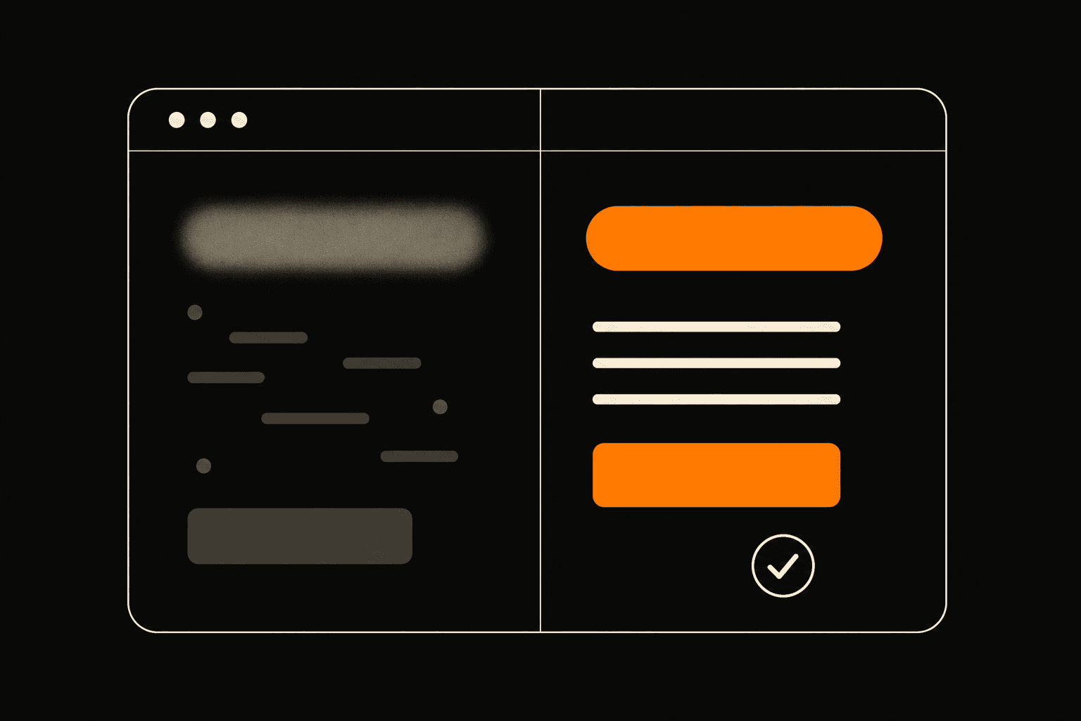
A website before-and-after is a side-by-side look at the same business site before and after its message gets fixed: same colors, same photos, sharper offer. The point isn't the redesign. It's what the words do once a visitor can finally tell what you sell, who it's for, and why you. Here's a composite example, built from patterns I see again and again.
Quick note before the numbers: the business below isn't real. It's a stand-in I assembled from a dozen real audits so I can show the moves without naming anyone. Treat the figures as an illustration of what a clearer offer tends to do, not a measured result from one client.
What does "before and after" mean for a business website?
Before and after means keeping the design and changing the message. In the "before," a service site looks fine and says nothing useful. In the "after," the same page tells a stranger in five seconds what they get, shows proof it's real, and points at one next step. Most of the work happens in the headline, the service list, and the button, not in the visuals.
Take my composite. A small home-services business. Clean site, decent photos, a hero that read "Quality you can trust, every time." Below it, a slider of pretty rooms and a navy button that just said "Learn more."
Nice. Also useless. Nobody could tell what the company actually did. Plumbing? Renovations? Cleaning? The visitor had to dig, and most don't dig. They leave.
Why does a vague offer cost you enquiries?
A vague offer costs enquiries because a confused visitor doesn't email, they bounce. When the headline could belong to any company in any trade, the reader has no reason to believe you're the right fit for their specific job, so they keep looking. Clarity is what converts attention into a message in your inbox.
The original headline, "Quality you can trust," is the problem in one line. It's true. It's also wallpaper. Every competitor could paste it onto their own site without changing a word. A headline that fits everyone sells for no one.
The button had the same disease. "Learn more" asks for nothing. Learn more about what? It gives the visitor a vague click instead of a clear decision, and vague clicks don't fill a calendar.
What changed from before to after?
Four things changed, and none of them touched the color palette. We fixed the headline, narrowed the services, added real proof, and rewrote the button. Same brand, sharper message. Here's each move and why it matters.
The headline got specific. "Quality you can trust" became "Bathroom and kitchen renovations in Xanthi, done in 3 weeks." Now a stranger knows the trade, the location, and the timeline before they scroll. A specific promise beats a warm adjective every time.
The services got narrowed. The old site listed nine things in tiny grey text. The new one shows three, the three that actually pay: full bathroom renovation, kitchen renovation, tiling. Fewer options, more bookings. When you offer everything, you sound like a generalist nobody trusts with the big job.
The proof got real. The "after" added three named reviews, before-and-after job photos of actual work, and a line about years in business. Strangers don't trust adjectives. They trust evidence. You can see how proof carries a page on my work page: the projects convince, the copy just gets out of the way.
The button got a job. "Learn more" became "Get a free quote in 24 hours." It names the outcome and sets a timeline, so clicking feels like a decision instead of a gamble. One primary action, repeated, pointed at from every section.
Did the redesign actually move numbers?
In this illustrative example, yes, and not because the site got prettier. The same traffic started converting because the message finally answered the visitor's questions. I'll give round figures so the shape is clear, and I'll repeat that these are illustrative, not a logged result from a named client.
Picture 1,000 visitors a month landing on the "before" page. A handful enquire, because most can't tell what's on offer. Now the "after" page meets them with a clear trade, a clear timeline, visible proof, and a button that promises a quote by tomorrow. The same 1,000 visitors hit a page that answers them, so more of them act. No extra ad spend. Same photos. Different words.
That's the whole lesson. A redesign that only repaints the walls gives you a prettier version of the same silence. The thing that moves enquiries is the message, and the message lives in the headline, the offer, and the call to action.
There's research behind treating the first seconds as make-or-break. The Nielsen Norman Group, which has run usability studies since 1998, found that the average time on a page is short and that users decide whether to stay almost immediately, which is why a page has to communicate its value fast. You can read their work on how long users stay on a page.
So before you pay for a redesign, read your own homepage like a stranger. Can they name what you sell in five seconds? Is there proof you're real? Is there one obvious next step? If any answer is no, your offer is the leak, not your layout. Want the shortcut? Send me your link and I'll tell you the one change that would bring you the most enquiries. If you'd rather start from a clear structure, my templates are built around exactly this: offer first, proof second, one button.