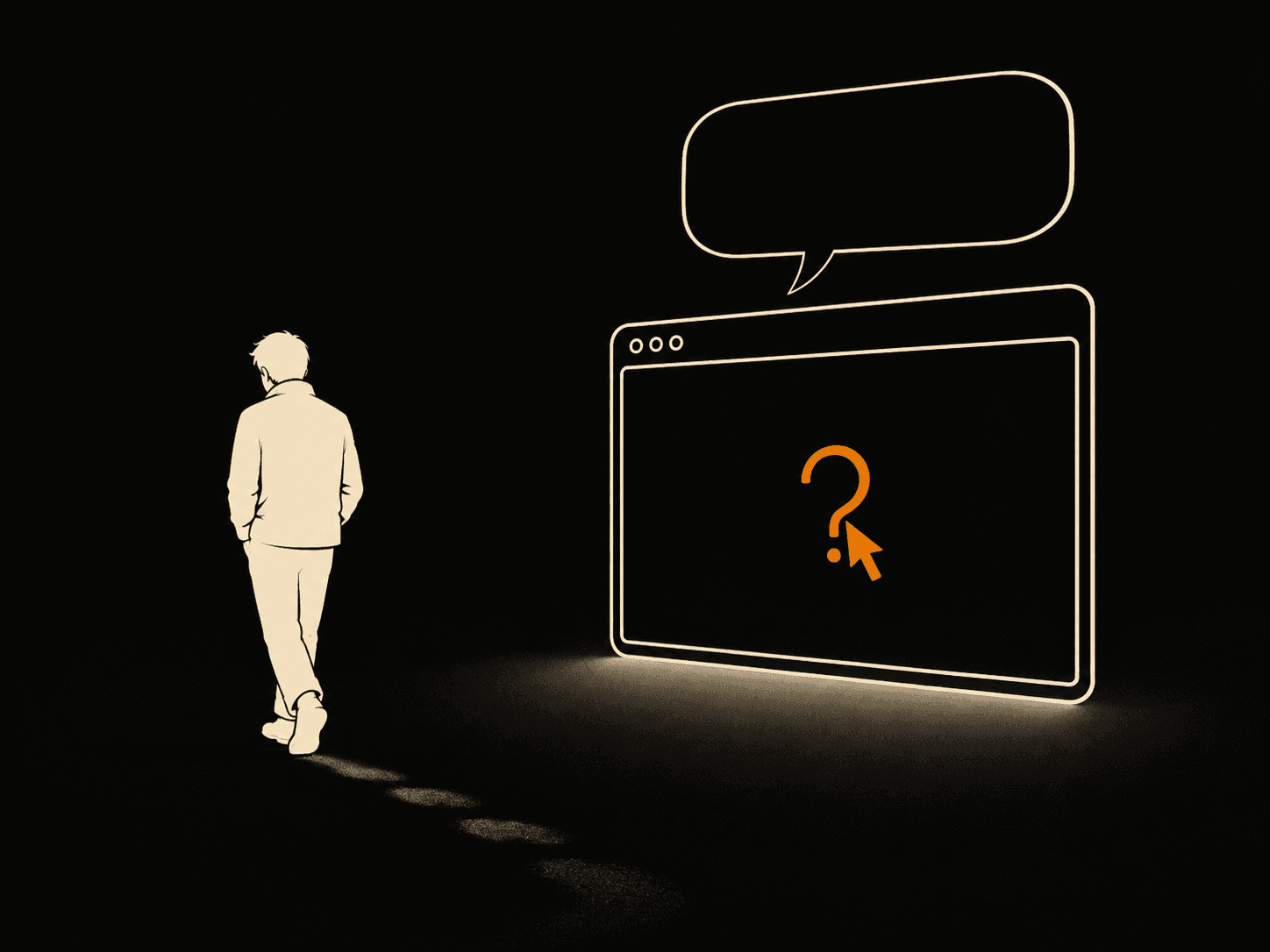
Most website problems are silent. A confused visitor does not email you to say the menu made no sense or that they could not find your phone number. They just close the tab and go somewhere else. You see nothing. No complaint, no bounce note in your inbox, just a number that never turns into a call.
I build websites for small and local businesses, and this is the failure I have to explain most often. The site looks fine to the owner because the owner already knows the business. They know what they sell, where they are, and how to reach themselves. A stranger knows none of that, and a stranger is who pays you.
A 2006 University of Glasgow study with Carleton University found people form an opinion of a web page in about 50 milliseconds. Faster than a blink. That first impression then sticks, because we read the rest of the page looking for reasons to confirm it. So if the first half-second feels off, you are already losing them, and they will never say a word.
Why don't visitors tell you your website confused them?
Visitors do not tell you because complaining costs them time and gives them nothing back. Leaving is free and instant. There is no form titled "report a confusing layout," and even if there were, nobody would fill it in. The web trained everyone to bounce. If a page makes them work, the next tab is right there, and your competitor is in it.
This is why analytics alone will lie to you by omission. You can watch your bounce rate climb without ever learning what people were confused by. The reasons leave with them. The only way to find the real problems is to put your site in front of someone who has never seen it and watch where they hesitate.
Here are the four silent killers I find most often.
Confusing navigation
If a visitor cannot guess what is behind a menu item, they will not click it. Clever labels are the usual cause. "Solutions," "Our World," "Explore" tell people nothing. "Services," "Pricing," "Contact" tell them everything. Name the destination, not a mood.
Too many menu items hurt just as much. Seven links is plenty for a small business. When a menu has fifteen, the visitor stops reading and starts guessing, and guessing feels like work.
Vague copy
Most homepages open with a line that could belong to any company on earth. "We deliver quality solutions tailored to your needs." That sentence says nothing a stranger can use. It does not name who you help, what you do, or why it matters.
Replace it with the plain version. "I build fast websites for local businesses in Greece." A visitor reads that and instantly knows if they are in the right place. Vague copy makes people decode you. Decoding is work, and work makes them leave. You can see how I write the first screen on my work page.
No reason to trust you
Strangers do not believe claims. They believe evidence. A site with no real photos, no client names, no examples, and no address reads as risky, even when the business is excellent and real.
Trust is built with specifics. Show the actual work. Put a real face and a real location on the page. One named client with a real result beats ten lines of "trusted by businesses everywhere." If you hide who you are, people assume you have a reason to hide.
Unclear contact options
This is the one that costs the most, because it fails the people who already decided to buy. If your phone number, email, or contact button is hard to find, a ready customer gives up at the finish line.
Your contact option should be visible without scrolling and repeated at the bottom. One obvious button, written as an action: "Get a quote," not "Submit." Make the easy thing easy. A contact section people can find in two seconds is worth more than another paragraph about your values.
How do I find what confuses people on my own website?
Run a five-minute test with one real person who has never seen your site. Sit them in front of your homepage, give them a simple task like "find out what this business does and how to contact them," and stay quiet. Do not help, do not explain. Just watch where they pause, frown, or scroll the wrong way. Every hesitation is a problem you could not see on your own.
The reason this works is that you cannot un-know your own business. You read your own headline and it makes sense because you wrote it. A stranger reads it cold, and their confusion is the honest signal you never get from analytics. Pick someone outside your industry. They will not paper over the gaps with knowledge you assume everyone has.
Here is the self-audit I run on every build before launch:
- Open your homepage and start a timer. In five seconds, can a stranger say who you help and what you do?
- Read your main headline out loud. Could a competitor put the same line on their site? If yes, it is too vague.
- Look at your menu. Does every label name a real destination, or are some just clever?
- Find your phone number or contact button without scrolling. Time it. Over two seconds is too slow.
- Ask the stranger one question after they leave the page: "What would you click first?" If they hesitate, your call to action is not clear enough.
Score yourself honestly. Each miss is a visitor you are losing in silence right now.
What to do once you find the problem
Fix the first screen first, because that is where most people leave. Get the headline plain, the navigation honest, one piece of real proof visible, and the contact button impossible to miss. You do not need a redesign. You need clarity in the places people look first.
The quiet nature of these problems is exactly why they survive for years. Nobody reports them, so nobody fixes them, and the site keeps leaking clients who never said a word. Run the test, watch a stranger, and you will see in five minutes what your visitors have been seeing all along. If you want a second pair of eyes on yours, send me a message and I will tell you what a stranger sees.