The 5-Second Homepage Formula
The 5-second homepage formula is a simple test: within five seconds of landing, a visitor should know who you help, what you do, why it matters, and what to do next. If your homepage fails that test, people leave before they ever read your pricing or your story.
I build websites for small and local businesses in Greece and beyond. The pattern I see most often is a beautiful homepage that says nothing useful in the first screen. Big photo, vague tagline, no clear next step. The visitor scrolls, gets confused, and closes the tab.
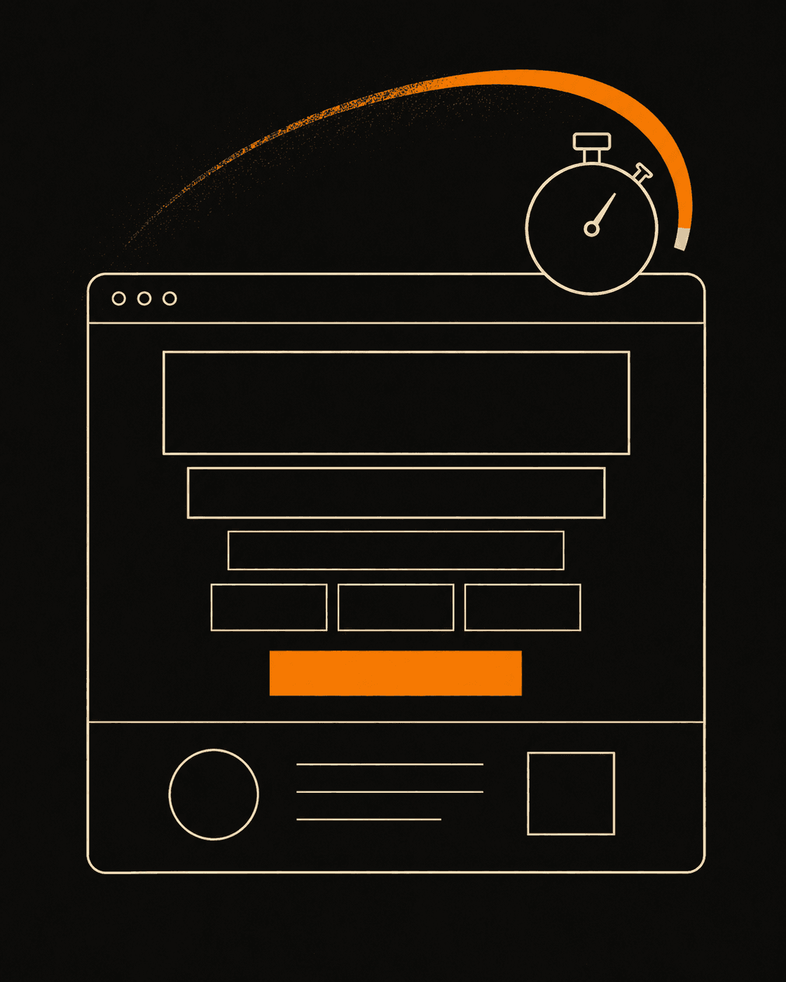
Five seconds sounds harsh. It is. Most people decide whether to stay on a page in well under that. A frequently cited Nielsen Norman Group analysis found that users often leave a page within 10 to 20 seconds, and that you have to communicate your value in the first few seconds to earn the rest of their attention. So I treat the top of every homepage as a five-second pitch with five parts.
What should a visitor understand in the first 5 seconds?
A visitor should understand who you help, what you do for them, why you are worth trusting, and what to click next, all without scrolling. That is the whole job of the first screen. Everything below the fold is for people you have already convinced to keep reading. If the top fails, the rest never gets seen.
Here are the five parts I put above the fold, in order.
1. Hero headline: say who you help and what you do
The headline is not your business name. It is the outcome you deliver, in plain words. A visitor should read one line and think "that is me, and that is what I want."
Bad: "Welcome to our website." Better: "Fast websites that turn local visitors into customers." The second one names the audience (local businesses), the thing (websites), and the result (more customers). Skip the clever wordplay. Clever costs you clarity, and clarity wins.
2. Subheadline: add the detail the headline skipped
The subheadline is one or two short sentences under the headline. It answers the obvious follow-up question: how, for whom, or what makes you different.
If the headline is "Fast websites that turn local visitors into customers," the subheadline might be "I'm Kyriakos, a web developer in Xanthi. I build Next.js sites that load fast and rank on Google, so the right people find you and book." Now the visitor knows you are a real person, where you are, and what tools you use. No jargon dump. Just enough to feel specific.
3. Proof: give one reason to believe you
People do not trust claims. They trust evidence. So right under the pitch, show one piece of proof. A real number, a named client, a result, or a logo row.
One strong proof beats five weak ones. "Built 40+ sites for local businesses" works. A single testimonial with a real name and a real outcome works better. If you have before-and-after numbers, like a load time cut from 6 seconds to under 1, use them. Show the work instead of describing it.
4. Service preview: show what you actually do
Once someone believes you, they want to know what they can buy. A short service preview, three or four items max, tells them without making them hunt through a menu.
Keep each one to a few words: "Business websites," "Landing pages," "Redesigns," "SEO." If you sell ready-made starting points, link them, like my templates. The goal is recognition, not a full catalog. They should spot the thing they came for in a second.
5. CTA: tell them exactly what to do next
The call to action is the one button you most want clicked. It should be obvious, high on the page, and written as an action.
"Get in touch" is fine. "Get a free quote" is better, because it tells the visitor what happens when they click. Put the main contact button in the hero, not just buried in the footer. One primary action. If you give people five buttons, they pick none.
How do I test if my homepage passes the 5-second rule?
Show your homepage to someone who has never seen it, let them look for five seconds, then hide the screen and ask three questions: who is this for, what do they do, and what would you click? If they can answer all three, you pass. If they hesitate, your first screen is doing too little or saying too much.
You can run this with a friend, a family member, or anyone outside your industry. The ones outside your field are the most useful, because they will not fill in the gaps with knowledge you assume everyone has. I do a version of this on every build before launch. It catches problems no analytics tool will.
A quick checklist for the first screen:
- Headline names the outcome and the audience.
- Subheadline adds one specific detail.
- One piece of real proof is visible.
- Three or four services are listed plainly.
- One main button says what happens next.
If all five are above the fold and a stranger can repeat them back, your homepage earns the scroll.
Why five seconds is worth the effort
A homepage that explains itself fast does the selling for you while you sleep. You stop losing visitors who would have been good clients but never understood the offer. Speed of comprehension and speed of loading work together: a fast site that says the right thing in five seconds converts far better than a slow, pretty one that makes people guess.
Start at the top. Fix the first screen first. If you want a second set of eyes on yours, send me a message and I will tell you what a stranger sees in five seconds.